1. Overview
aktive.chat is built as a high-precision, technology-driven platform that makes real-time AI translation and live captions feel seamless and intuitive. Its identity is rooted in the “Dark Sheet” principle — a controlled, minimal dark interface with a premium and forward-thinking character. The system relies on strict grid structures, sharp edges, confident typography, and deliberate contrast to communicate clarity, performance, and advanced software craftsmanship.
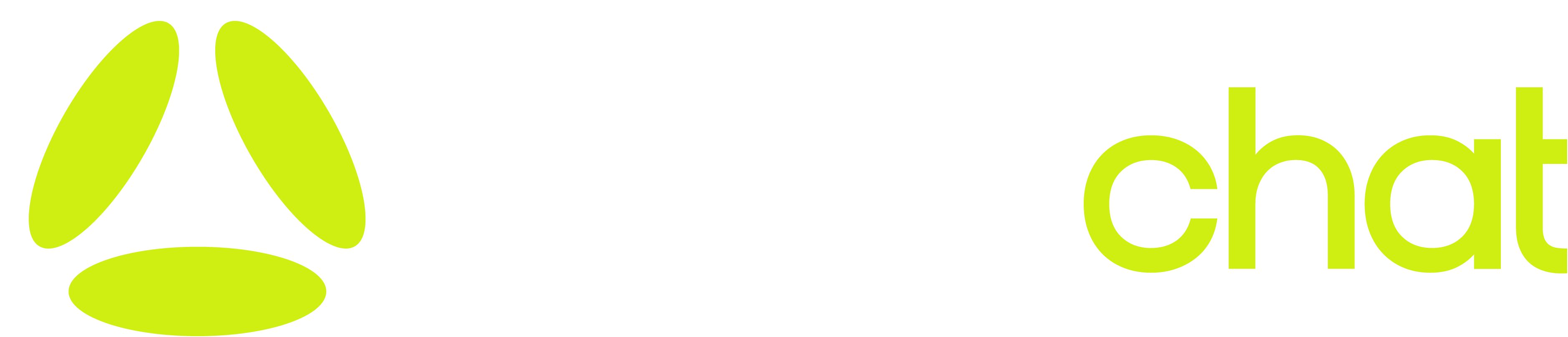
2. Logo
Primary Logo: aktivechat-typo.png typography mark accompanied by the icon (favicon.png).
- Placement & Usage: Used prominently in headers and footers with a transparent background. To maintain visual balance, the logo must always have designated breathing room (padding) and must never be crowded by other elements. Against dark backgrounds (
#0b0b0b), the logo should be bright/white or use the primary brand accent.
3. Colors
The brand relies primarily on a sophisticated, deep dark theme, utilizing stark contrasts and a highly vibrant neon accent to draw attention.
Click the copy icon on any color to copy its HEX value.
Primary Base
#0b0b0b (Deep Charcoal Black)
Used for outer pages and core sheet backgrounds.
Secondary Base
#111111 (Elevated Ash)
Used for cards, inner widgets, and hovering states.
Borders
#222222 (Structual Dark)
Thin, 1px lines used strictly for structural wireframing.
Primary Text
#f4f4f5 (Bright Off-White)
Used for Headings and active states.
Secondary Text
#a1a1aa (Muted Grey)
Used for paragraphs, subtext, and descriptions.
Accent Primary
#cfee12 (Neon Lime)
The signature color. Used sparingly for critical CTAs.
4. Typography
The typography system strictly scales based on functional purpose, pairing a specialized, confident display font with a highly legible structural font.
a b c d e f g h i j k l m n o p q r s t u v w x y z
A B C D E F G H I J K L M N O P Q R S T U V W X Y Z
0 1 2 3 4 5 6 7 8 9 ! @ # % & *
- Used for h1 through h4.
- Styling: Font-weight 400 (or 500), tightly spaced (
letter-spacing: -0.02em) for a premium layout feel, colored bright white (#f4f4f5).
Standard body copy sits firmly at 15px with a line-height of 1.6 to optimize scanability. Subtext and disclaimers use smaller sizings like 0.85rem. Weights shift logically: 300 for long paragraphs and 500 for structural elements and buttons.
Used explicitly for version tags (e.g., v0.0.1), metadata, or coding properties. Gives the platform a builder/engineer atmosphere where appropriate.
5. UI Principles
- "The Sheet" Structure: Content is heavily contained horizontally within structured maximum widths (like
1440pxor800pxfor copy), ensuring text lengths never extend indefinitely. Core boundaries are often defined by rigid 1px borders tracking alongside columns. - No Drop Shadows: Depth is not established using soft, diffused shadows. Instead, we use solid borders, background contrasting (
#0b0b0bvs#111111), and stark architectural lines. - Sharp Elements: Buttons, layout containers, and form fields typically utilize
0pxborder-radius to maintain a stark, precise, engineering-driven aesthetic; though a select few interactive "pill" elements use fully rounded corners (50px).
6. Imagery & Motion
Imagery: Focused on technical representations, software mockups (like the 3D Bar charts, or split-screen UI highlights), and highly stylized photography.
Motion: Animation loops are subtle. Primary use of motion includes the gradientShift effect over accent text (e.g., "AI translation") which drifts smoothly over 3 seconds, or a rigid text-ticker representing languages rolling across the layout without stutter. Focuses on performance and intentionality without becoming distracting.
7. Voice & Tone
- Direct & Confident: Text favors actionable, descriptive language ("Real-time AI translation & live captions for events").
- Minimalist & Technical: Avoids overly fluffy "marketing language". Explanations are clean, formatted with bullet points, and focus rapidly on how things work.
- Progressive: Assumes the user is smart and looking for a next-generation solution.
8. Use Cases
The design scales naturally to fit various contexts:
- Dashboards & Workspaces: High utilization of the border layout and the Space Mono font for configuration pages, setup guides, and live logs.
- Public Landing Pages / Marketing: Expands heading sizes drastically (
h1: 4.5rem,h2: 3rem) and utilizes heavy grid displays (grid-template-columns: 1fr 1fr) to juxtapose descriptive text against visual mockups.
9. Accessibility
- Contrast Checks: The primary off-white (
#f4f4f5) on deep black (#0b0b0b) ensures massive readability passing minimum WCAG contrast standards. Muted paragraphs are strictly kept at#a1a1aa, guaranteeing they don't fade into the background. - Semantics: Employs appropriate semantic tags (
<main>,<header>,<footer>,<section>,<article>). - Interactive Aria: Buttons opening sidebars, toggling mute logic in widgets, and social links rely heavily on inline SVGs equipped with appropriate
aria-labeltags (e.g.aria-label="X (Twitter)").